Decorative maps
A stylized map of your course, sized to share online: styles, shapes, markers, and lettering.
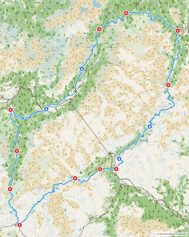
A decorative map is your course drawn over a stylized street map — bold colors, a title block, and none of the clutter of a working map. It’s made to be shared: a race page, a social post, a newsletter header, a slide.
If you need street names legible for a permit or council submission, that’s the other kind — see High detail course maps. For access, entry points, and how long a render takes, see Map images: which kind to make.
Starting one
From a Race page, click Image in the toolbar and choose Decorative map. From your profile sidebar, go to Images and click Create.
If you didn’t come from a course page, search for one of your races or routes in the Course field. As with high detail maps, the marker and lettering sections fill in once a course is chosen.
Name
Optional, and not drawn on the map — it’s just how you’ll find this map in your list later. Blank means it takes the course name. The words that do appear on the image are set under Lettering, further down.
Style
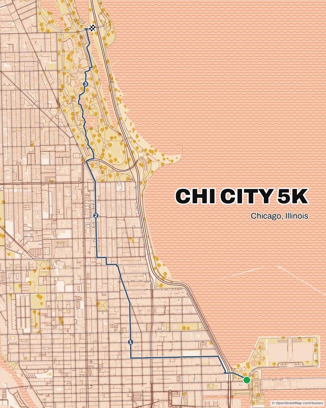
Nine palettes. Each sets the paper, roads, water, and greenspace together. Five of them are shown here — the same examples as on the homepage:
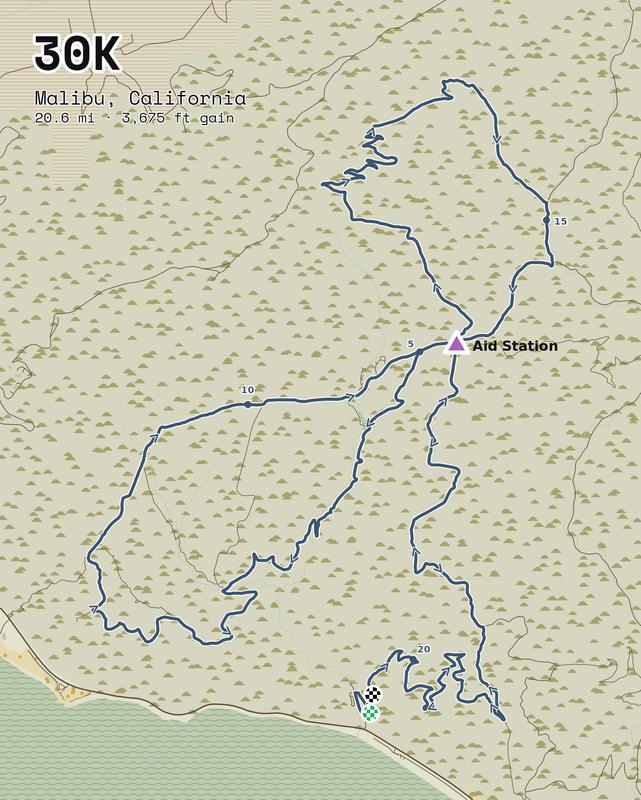
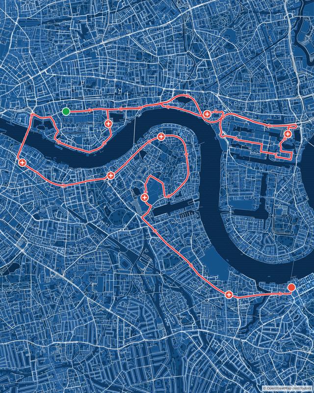
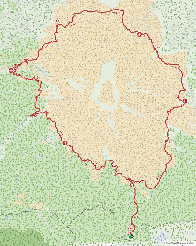
What each one does:
- Light — soft cream paper, charcoal roads. The default, and the safest choice.
- Minimal — white paper, black roads, almost nothing else.
- Dark — near-black paper with grey roads.
- Peach — warm pinks and sand.
- Blueprint — white lines on deep blue, like a drafting print.
- Vintage — muted olive and parchment.
- Forest — deep greens with pale roads.
- Meadow — earthy browns and greens, like a trail map.
- High Contrast — black roads and ink-dark water on white. The boldest of the set.
Style choice is worth pairing with your course. A dense city course carries Minimal or Blueprint well, because the road network itself becomes the pattern. An open trail course has fewer roads to draw, so Forest, Meadow, or Vintage — where the green and the water do the work — tend to look better.
Shape
Seven shapes, offered in mirrored pairs so you can frame the course the way it actually runs:
- Portrait (4:5) — the default, and what most feeds expect.
- Portrait (3:4)
- Story (9:16) — tall, for phone-screen stories.
- Square (1:1)
- Landscape (5:4) and Landscape (4:3) — the same two portraits turned over.
- Widescreen (16:9) — for a page header, a slide, or a video thumbnail.
Pick by the course, not just by where the image is going. A point-to-point that runs east–west wastes most of a portrait frame on empty ground either side of the route; a landscape shape fills it. A loop is usually happy in anything.
North stays up whichever you pick; a portrait shape pads the frame above and below rather than rotating the course, and a landscape one pads it left and right.
Breathing room
How much of the surrounding area to include around the course: Tight (0%), Balanced (8%, the default), Roomy (15%), Wide (25%), Very wide (40%).
This is a design decision, not a technical one. Tight makes the course the subject. Wider settings pull in more of the city or the surrounding hills, which suits a course whose place is the point — and gives the title block somewhere to sit that isn’t on top of the route.
Route color, width, and outline
The course line itself. Color is a swatch or a hex value (the default is a red, #ef4444), and width runs Thin (2), Medium (4), Thick (6), Extra thick (8).
Outline the route in white is on by default, and worth leaving on. It draws a thin white edge around the line so the course still reads where it crosses a dark park or a river, instead of vanishing into it. Turn it off for a flatter, more graphic look on a pale style.
Markers
Same as on a high detail map: tick the Start, the Finish, and whichever points of interest you want drawn, then set each one’s shape, color, and whether its name shows.
Shapes are circle, square, triangle, and the point’s own map icon knocked out of the disk — the last is the default here, so an aid station looks like an aid station. Endpoints have no icon of their own, so they use the plain shapes. There’s also a Checkered box that fills any shape but the icon with a checkerboard, for a finish-flag marker.
A decorative map is usually better with fewer markers than a briefing map. Start, finish, and perhaps a summit is often plenty; twenty labelled aid stations turn the frame into a working document.
Distance markers
Optional distance labels along the course, with three styles:
- Dot on the course, number beside it — the default, and the quietest.
- Numbered circle on the course
- Boxed label beside the course — the loudest of the three, and the same style high detail maps use.
Set the Interval (every 0.5, 1, 2, 5, or 10) and the Units, or leave the interval on None.
Course direction
Arrows showing which way the course runs: Arrows beside the course or Arrows on the course line, at an automatic or fixed interval. Most decorative maps leave this off — it’s working detail rather than something to look at — but it earns its place on a course that loops back on itself.
Lettering
This is what makes it a piece of design rather than a picture of a map. Everything in this section is drawn on the image itself.
Title, subtitle, and third line
Title is usually the race name; subtitle is usually the place or the date; third line is usually the distance and elevation. All three are optional, and all three are ordinary text — type anything, or leave a line blank to omit it. Use course name fills the title from the chosen course. Insert distance & elevation writes the course’s stats into the third line, in the units chosen under Distance markers, so you can then edit the wording rather than stamping whatever metadata happens to sit on the course.
Placement
Nine positions — the corners, the edges, and the centre. Click one, or drag the lettering around the preview and it snaps to the nearest.
The preview sketches your course as a rough line underneath, so you can see whether the title lands on the route before you spend a render finding out. It’s a sketch of where things sit, not a picture of the finished map.
Lettering
Six pairings rather than a font menu — each sets the title in a display face and the lines beneath it in a companion that goes with it. The buttons show each one in its own face:
- Bold Sans — heavy and modern. The default.
- Condensed — narrow. Fits a long race name without shrinking it.
- Classic Serif — traditional and formal.
- Typewriter — technical; suits Blueprint.
- Hand — informal; suits Peach and Vintage.
- Standard — plain and neutral, for a map that wants nothing said.
Size and ink
Size is Small (lets the map lead), Medium, or Large (the usual title size, and the default). Drop to Small or Medium if a long race name is crowding the frame.
Ink is the color of the type: Black (for pale maps), White (for dark ones), or the same two with a contrasting outline. Black with a white outline is the default because it stays readable wherever the course happens to run underneath it.
The OpenStreetMap credit
The last thing on the form, under the lettering, is a box: Print “© OpenStreetMap contributors” on the map. It’s ticked by default, and the credit prints small in the bottom-right corner.
You can untick it — this is a piece of design, and a line of type in the corner isn’t always wanted. Unticking asks you to confirm, because it changes where the credit goes rather than whether you owe it. The map data is open, and the license lets the credit sit beside the work instead of on it. So if you take it off the image, you still need to credit OpenStreetMap wherever the map appears — the caption under it, the page it sits on, the credits page of the race guide.
Maps made before this option existed keep their credit and reopen with the box ticked.
Generating
Click Generate decorative map and give it a few minutes — we pull fresh map data for the area and render the image at full resolution. Use Email me when it’s done and close the page if you’d rather not wait; the render carries on without you.
What you get
You land on the map’s page, where you can magnify the preview or click Inspect detail to look closely.
The preview is watermarked. A one-time $9 payment removes the watermark and unlocks the full-resolution file, and earns you $9 of credit toward a HelloDrifter subscription — see Buying, downloading, and updating a map image.
Iterating
These take a few attempts. Click Edit on the map’s page to reopen the form exactly as you left it, change one thing, and generate again.
Once you’ve bought the map, editing and re-downloading stay free as long as it’s still substantially the same course — 80% or more of the course overlapping the one you paid for. So you can keep refining the style, the lettering and the markers after you’ve paid, and still pick up edits to the underlying race or route. A course that changes beyond that counts as a different course and needs its own purchase; see Buying, downloading, and updating a map image.